Fonts to be used
After the extensive research done for the selected masthead where I tried tens of fonts style, I decided to remain consistent and only use the 2 simple styles selected: horizon (for masthead and possibly for headlines) and Lato for the body text.
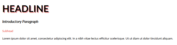
The color palette will be simple and consistent too: black fonts for body text, accent red for headlines and subheads. In order to emphasize some ideas, I will simply use bold, italic or underlined text
In terms of size, I simply used random texts written in different sizes and then I printed them in order to make comparison between these prints and between them and other magazines. I finally decided to use the following combination:
- headline: red& black, Lato 26; effects: Echo/ Offset +50/ Direction -45/ Color: red;
- introductory paragraphs: black, bold, italic, Lato 10; no effects;
- body text: black, Lato 8; no effects;
- subheads: red, Lato 8; no effects.