Chosing the name
My magazine addresses to DIYers and will feature tips about design and materials for house and garden remodeling. Hence it’s a more technical magazine for which a suitable title should be very straightforward, without subtleties.
I started by researching the word HANDYMAN for meaningful inspiration.
Noun: handyman
Oxford Languages definition:
- a person able or employed to do occasional domestic repairs and minor renovations.
Merrian-Webster definition:
- a person who does odd jobs;
- one competent in a variety of small skills or inventive or ingenious in repair or maintenance work, called also handyperson.
Synonyms/ slang:
Odd-job man, Off-jobber, Handy Andy, Factotum, Jack of all trades, Man of all work, DIY expert, DIYer, Knockabout, Rouseabout, Loppy, Bricoleur, Mr Fixit, Man Friday, Guy Friday.
First I was attracted by the Handy-Andy choice, but then I realized it was already used as a brand by some cleaning solutions. In addition, it sounded a little bit too pally.
I intend to have my magazine more technical, addressed both
- to the habitants of the dwellings – with design ideas and useful tips in selecting the materials,
and
- mostly to the handymen hired for the renovation/ decoration – with tutorials and expert advise.
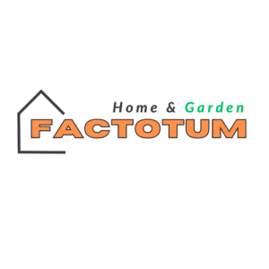
It should be a tool for collaboration between the beneficiary and the worker, bringing them together with expertise for the intended work project. Considering this, I opted for the word FACTOTUM, with latin origin, straightforward and exhaustive connotation. In order to narrow down the significance of such powerful word, I decided to include in the title the clear areas of applicability: HOME & GARDEN.
Design
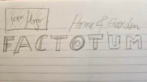
First I made a sketch by hand. I needed something very simple, yet very visible due to colors and icon selection.
For the design I used Canva app.
I started by writing down the words chosen and find acceptable fonts. Horizon style looked perfect from the very beginning due to it’s boldness, while for the Home & Garden I wanted a more refined choice, but still very classical and easy to read. I chose Lato and made them italics, like in my handwritten prototype, to make it look like an explanation.
Then I played with the colors. I immediately associated the Garden word with green color, while for the Home I used the classical black. For the main element, the word Factotum, I played with several colors to contrast with the above green. I finally decided upon orange, which is a bright color also frequently used for cloths and tools in construction. But bold bright colored letters get diluted from the readers’ focus, hence I opted to add as effect a black outline.
The only remaining task was to find a suitable icon or symbol for a house. I scrolled the templets from canvas and selected several examples which I integrated with the already prepared text. There were 3 Masthead drafts eligible which are shown bellow.
I decided to keep the 2nd one (the one wrapped in a box) as I felt is was the most balanced.