Looking for Magazines examples
My research was made using the online publishing platform https://www.magzter.com .
I selected one issue of each magazine which inspired me most from my 3 main areas of interest, i.e. DIY, outdoor activities, reptiles:
- The Home Handyman
- Trail Run
- Reptiles
1. The Home Handyman
The Home Handyman magazine is a specialized DIY publication from South Africa providing reader with expert advice and simple/ cost effective solutions for home improving ideas.
This magazine is my main inspiration for my prototype, therefore this is the one I studied it in-depth.
1.1. Cover Analysis
In the example chosen I found all conventions applicable to a magazine cover and I made a mindmap with them in the picture below.
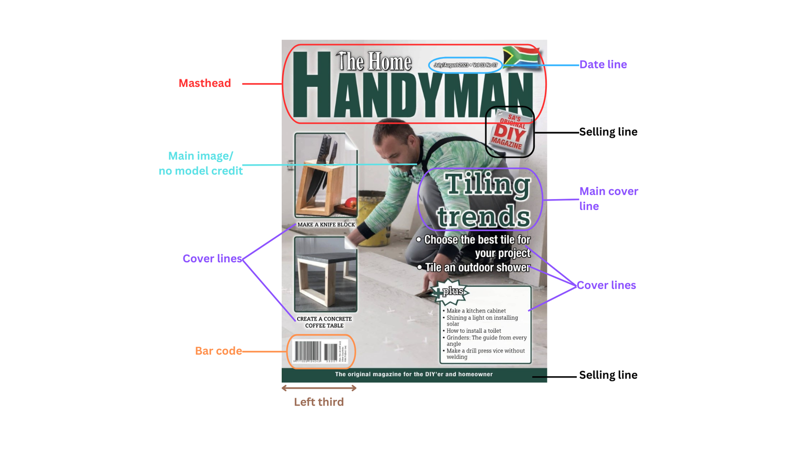
The Masthead is made of 2 distinctive elements: “The Home” and “Handyman” and is a larger declination of the logo of the magazine. The 2 elements are very different in terms of style, i.e.: size, color and fonts.
- “The Home” element looks more like a logo. It is only one third in height compared with the second element. It is always white, with capitalisation on each word, while the fonts have outer shadow to make them more visible. There is also another choice made for the element to stand out, i.e. replacement of the first letter T with the icon of a hammer, confirming right away to the audience that this is a DIY magazine for home solutions, as the word Home is present too.
- The second element, “Handyman“, catches the eye of the reader through it’s considerable size with bold colored capital letters, the first letter being even larger, used as an anchor for the first element. In the issue under current scrutiny, the element is dark green, but I noted that each magazine issue brings a different color for the word Handyman, the respective color being also used for the main cover line. Except for the matching colors idea between masthead and main cover line, I am not sure what is the trigger for the choice of the color, but most probably the intention is to have a contrast with the color from the main image and to make the left third of the cover stand out and helping the readers to know whether there is a new issue of the magazine.
- Even if the color of the 2nd element changes all the time, the style and the relative position of the elements to each other is freeze into a very recognizable layout.
Target Audience is clearly a well-defined niche audience of DIYers and homeowners implied by the converging selling lines, and the icon hammer and the punchy words from the masthead (home, handyman).
My attention was drawn to the particular way of displaying the cover lines into 3 different styles. Instead of just naming several topics from the magazine content (as we can see in the white bullet points from the right side), the editor chose to also using in the left third of the cover representative photos for some topics, while on the right side emphasizing others by simply wrapping the respective text into a box. What a genius approach to catch the eye of the audience, conveying the idea that there are plenty of interesting subjects to be uncovered while reading the magazine. Surprisingly, this added complexity to the cover remained clean and tidy, without distracting from the main image too much.
I’ll definitely try to use this approach.
The main image shows a handyman placing new tiles on the floor. His neat cloths and the spotless grey light tiles denotes his extensive knowhow and the mastery of the work done, i.e. a true expert at the readers disposal.
Both the date line and the barcode are visible in the most conventional way.
1.2. Table of Content analysis

The ToC is laid on 2 pages and the layout is set out in 4 columns:
- The 1st column is allocated to the About and Contact information. It starts with the logo of the magazine, which, regardless of the choice of colors for the masthead, the 2 elements are always the contrasting red and black, very powerful and visible composition, suitable for the educated audience.
- The 2nd and the 3rd columns include the content of the ToC, one column being dedicated to the Features category of articles, while the second one to the Regulars. The content mirrors the colors of the logo, making the whole table very neat and balance: the headings of the articles are painted in red, giving an accent to the whole image and thus making them easily readable, while the subtitles and the page numbers are in black. The subtitles give very generous amount of details about the articles, which became quite a challenge to editing, their fonts becoming very small. On the other hand, the page numbers are the largest fonts of the content; not having the advantage of the accent color, their size give them the write catching tool of the reader’s eye.
- The 4th column is hosting representative pictures for some feature articles. The editor made an interesting choice to providing images for different feature articles instead of one for the main feature article. The images are linked to their respective articles by the page number indicated in the content of the ToC. Lastly, the 4th column includes also a text box with a separate ToC content related to organized competitions and giveaways available in the magazine.
1.3. Double-spread feature article analysis
The below double spread is the first article under the “features” category.

The 1st page contains the headline, a sort of subtitle or pull quote, the introductory paragraph, and a feature image. No byline displayed.
The headline follows the normal conventions: very large fonts (4 to 5 times larger than the fonts used in the article), straightforward, with a very clear description: “how to choose the best tile for your home project”. It is written in white capital letters superposed on the featured image. On the same picture, on the right hand high corner there is also a sort of sticker with a comment meant to set the readers’ bearings: “each tile you choose depends on your budget, your style and how you need your space to function”. I think this is a variation of a pull quote, conveying to the reader the “framework” for the research made available by the article.
The introductory paragraph is actually an extensive introductory article with many paragraphs providing the reader with an overview of all existing tiles category, and includes basic knowledge about tiles, such as composition and main characteristics. The content is laid out into 3 columns making it easier to be read and it even if the fonts are small. The feature image is spanning over the 3 column-width and presents a possible end result of a professional tilling project.
This introductory part of the article is as long as the body text, which is unusual, but for this genre of magazine and for the topic chosen it seems normal. There is no color pallet; all the text is written in plin back, which is appropriate for a technical magazine.
The 2nd page includes the body text and an image from a show room of tiles.
The body text is well emphasized by being included in a text box with a grayish background. It is subdivided into several sections with different subheads standing out by having bold fonts with dark gray highlight.
The entire layout of the double spread article is very balanced by the positioning of the 2 images at the beginning of the 1st page and at the end of the 2nd one, while the introductory and the body texts are formatted similarly in 3 columns with the same back sized fonts. the images and the text boxes have similar sizes.
2. Trail Run
This magazine is entirely devoted to the dirty art of trail running.
2.1. Cover Analysis

Masthead: 2 words “trail” + “run”, with the second one being emphasized by bold letters. The 2 font styles make the audience aware that this is a specialized running magazine, i.e. running in trails. It is definitely a complete different kind of activity, hence this is again a magazine for a niche audience.
Main Image: the picture used denotes a mountain trail animated by a model in focus in the middle of the image, with a blurred background. This photography technique enables the reader to focus on the model facial expression which brings all the necessary connotations for this genre of magazine: ambition, endurance, perseverance – the compulsory traits for embracing such a difficult sport. These connotations are also supported by the other details of the focus area: muddy trail, dirty legs and cloths. There is also a subliminal connotation given by the rough environment shown, i.e. the quality and resistance of the specialized apparel used by the model.
The blurred background keeps the earthy/ muddy color which enhances the feeling of being outdoor. In the same time, this color shade is an excellent background for the white fonts used for all the information available: masthead, main cover line, cover lines, date line and barcode.
The cover lines are organized in the left third of the cover, while the main cover line is on the right hand side of the cover, vertically centered vs. the cover lines, bringing a balanced layout, without diluting the focus on the model in the middle.
2.2. Table of Content analysis

The ToC is displayed on a single page on the the left hand side, while the entire right side page is fully allocated to ads.
The layout is set out in 2 columns, each containing 2 eye-catching containers with different categories of articles: trail mix, features, reviews, subscription ad.
Each container includes a top feature image of the main article in the respective category, while the bottom is dedicated to the remaining articles in the respective category. The title and the page number of the main feature articles are placed on the top of the selected images. They are written with white fonts, significantly larger than the fonts used for the rest of the ToC content. Additionally they are highlighted with a red background, making them impossible to be overlooked. The bottom is setup like a blackboard with the indexed articles edited in the contrasting white and red colors. This contrasting color palette makes it very easy for the reader to navigate the ToC.
2.3. Double-spread feature article analysis

We cannot see a big headline, as this double spread snapshot if a continuation of an article from the page before. Hence, the headline is small, looking more like a header of the page, just for reminder of the article topic.
The feature image of the 1st page is very large, occupying 2 thirds of the page. It denotes a traveller enjoying a nice walk in a very nice scenery where the mountains meet the sea. Both the model and the scenery bring the connotations of serenity and mindfulness, the perfect ingredients of the mentioned medicine from the title. Above the image there is a byline crediting the photograph.
The body text is written in the form of an interview, using quotes from the interviewed character. It is written with small fonts and arranged in a 3 column-layout.
The 2nd page is built as a moodboard of the topic made of a pool of pictures which compliments each other to support the idea set in the title: running is medicine (both physical and mental). I love this idea and will try to make use of it in my prototype. Below each image there is has a caption written with fonts similar in size as the ones from the body text, but they have italic style.
Both pages have in the footer both the page number and the masthead of the magazine.
3. Reptiles
REPTILES magazine is bringing readers articles written by experts about reptile and amphibian care, veterinary topics, conservation issues, natural history and all things “herp.”
3.1. Cover Analysis

The Main Image is a close up of a brown reptile’s head, with excellent texture details to be observed. The background is a contrasting green shade, from the same nature like category color palette available in the reptile photo and in line with the magazine genre.
A good matching, while contrasting color, was used to emphasize the Masthead, i.e. light yellow, also drawn from the nature like category color palette. The fonts are large and with a nice special style, more “organic” with subtle natural shapes.
The same yellow color is used for the main cover story, while the remaining cover lines alternate between white and yellow, to make the reading easier. From the list of the cover stories, it seams the magazine addresses to a wide target audience: beginners looking to get their first pet reptile, or experienced keepers wanting to try something new, as well as anyone loving reading about reptiles.
All the other conventions are used in a quite standard way:
- selling line next to the masthead: “the world’s leading reptile magazine”;
- date line and barcode available;
- some special focus on the left third area.
3.2. Table of Content analysis

The ToC is spread on a single page.
There is a 2 uneven column layout, the 1st one being dedicated to the feature articles, while the larger column is being populated with images of different reptiles representative to the articles presented in the ToC content. The images are easily traceable to their respective titles by displaying the page number which is also anchored to the titles. This layout is very eye-catching, making the selection for the reader easier.
A special note of this ToC is given by the use of headings and sublines next to the name of the author for each article. The fonts used for headlines, subtitles and authors are all black, but smaller and smaller, making the reading very well targeted. The page numbers are set to be large and green, which is another tool to avoid being lost between lines.
3.3. Double-spread feature article analysis

Being an educational magazine, it is expected to have a lot of text. The editor played with the layouts combining 1 and 3 column-templates, as well as different size of fonts allocated for the above 2 mentioned layouts. This technique, coupled with the use of bold and larger fonts for the subtitles, make the reading easy.
In addition, the eye-catching photos pull out the reader from the text monotony.

