Cover Design
I started by bringing my input from the planning phase:
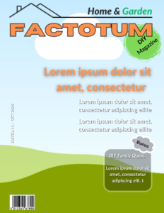
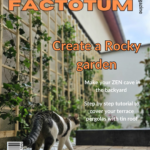
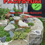
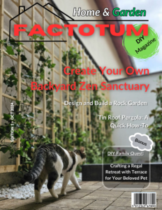
After combining these elements and deciding upon the cover lines, I worked a bit on the colors from my logo in order to make it more visible, as well as on the positioning of the barcode, selling line, edition ID and I obtained the following Cover drafts:
I sent out my drafts to several people for feedback.
The main criticism was related to the color of my logo/ masthead. Although a very contrasting option with the main image which made my orange masthead very visible, it seemed lacking the profesional vibe I was trying to convey.
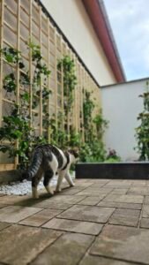
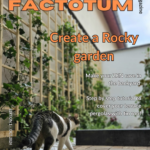
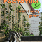
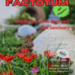
After trying several other colors, I opted for the red and also tried out several other pictures to be able to compare the visual impact. I obtained the second batch of drafts which can be found here after.
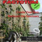
After a new round of feedback, I decided to keep the original choice for the main photo and the red option as the main color of my masthead.
I also decided to give it a try and lose the black border of the letters. In order to regain the focus upon the FACTOTUM element of the masthead, I enlarged the perimeter of the house icon.
I was very happy with the result and acknowledged it as my final version.

ToC Design
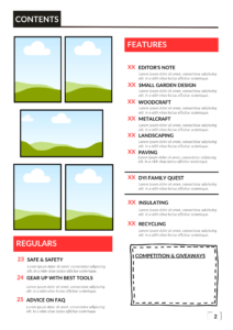
Display of the input from the planning stage: flatplans and images selected.
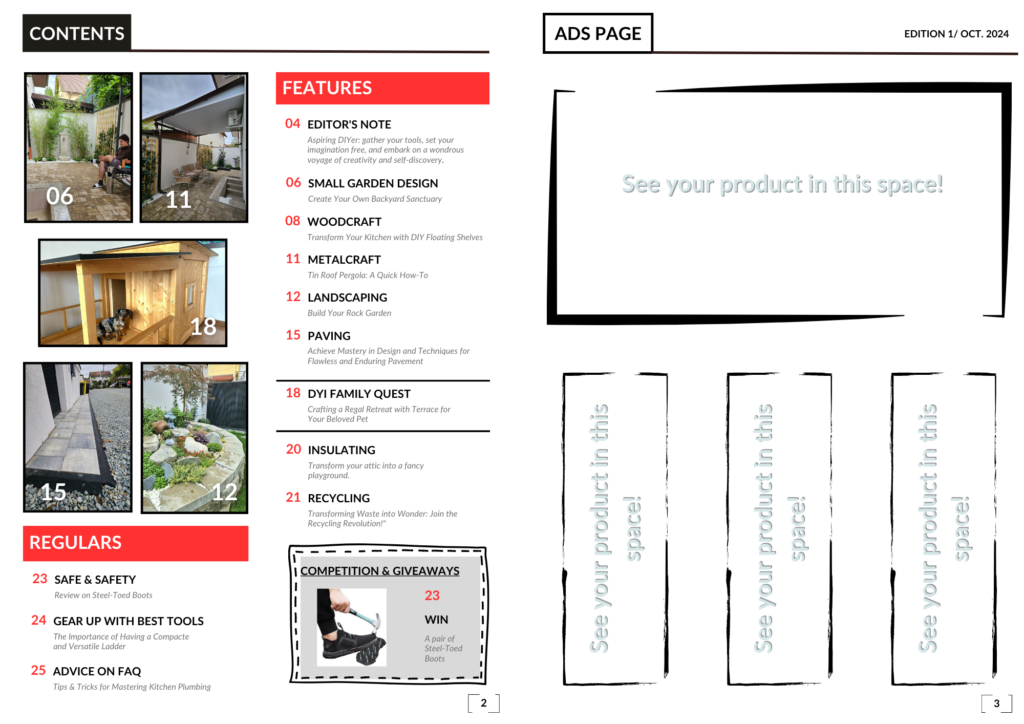
The effort made to prepare a very detailed flatplan paid off! I only needed to decide on the subtitles, filling in the photos to the prepared frames and make some minor fine-tuning of the layout.
I didn’t need several drafts. The result was right from the 1st draft, which became also the final version.
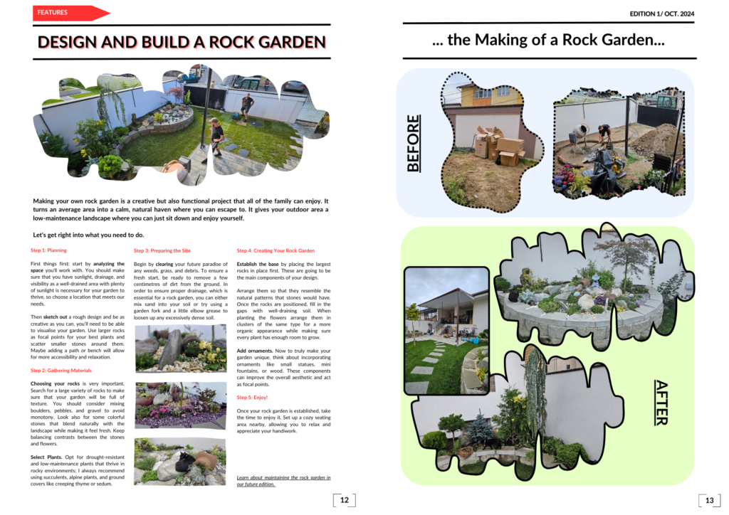
Double Spreadsheet Feature Article Design
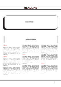
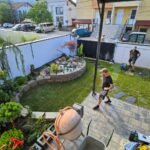
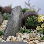
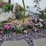
Display of the input from the planning stage: flatplans and images selected.
Writing the article was more challenging than expected. Even if the topic was from my latest work experience, so very fresh in my mind and dear to me, I needed to rewrite it several times in order to reach the suitable length to fit in the flatplan. I needed to eliminate a lot of information without diminishing too much the value of the content. Integrating the 3 close-up images made the whole editing process even more troublesome.
The intermediate drafts are not worth mentioning. They looked more like chaotic moodboards.
In the end I succeeded to obtain a version I was happy with and I made it the final version.
