App Used
As I don’t have any experience with editing apps, I dived directly into Canvas app, which is renowned for it’s user friendliness and for the decent selection of elements available to use for free.
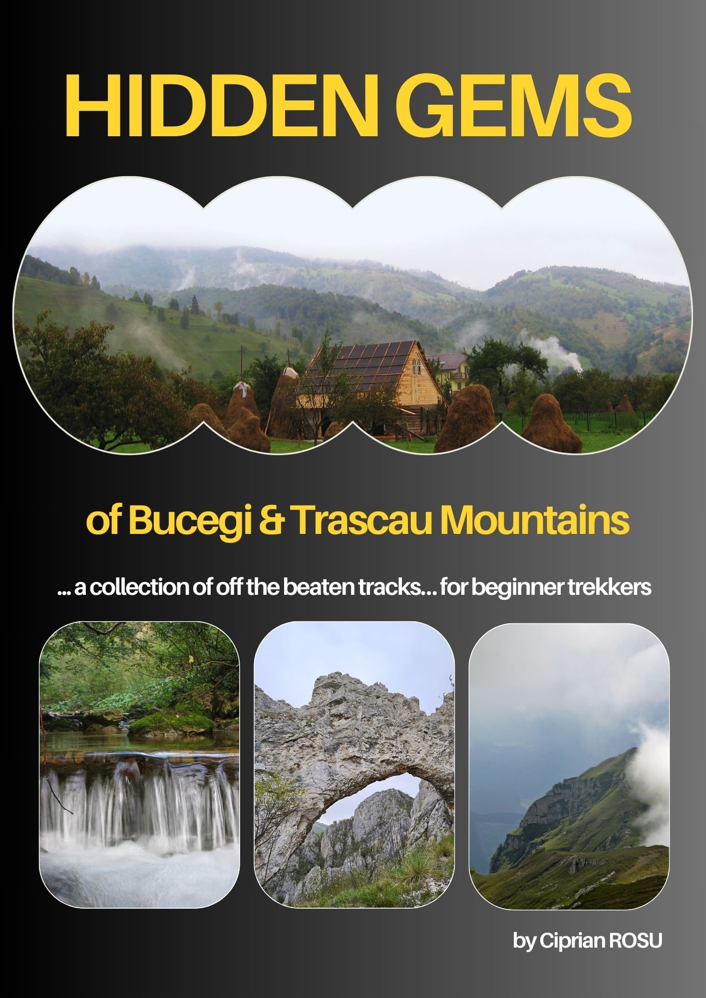
Selection of Template
I started by putting next to each other my top selection of templates before deciding on the final one.
- it looked too much as a magazine cover
- it looked a bit messy;
- maybe more suitable to teens audience
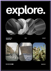
- loved it! but I got the feeling of a photo collection only… and professional photos;
- it seemed more suitable for photography art collection.
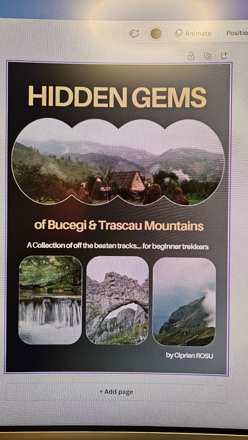
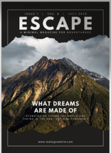
- bingo!
- clearly a photo album cover;
- not too many photo spoilers, not too less to risk lack of interest.
Selection of Images
It seemed straight forward.
The top layout was favorable to bringing the calm atmosphere I wanted to convey, so the hay stacks surrounded by fog seemed the obvious choice.
The 3 bottom frames allowed to give a hint of the fact that the destinations referred to have everything: rocky mounting tops, walking trails in the clouds, fresh springs.
I didn’t further edited the photos when uploading them to the template. I only saturated a bit the top photo in order to stand out better from the whole cover.
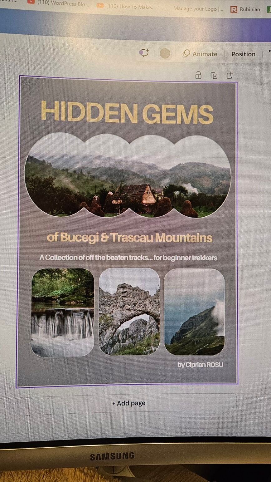
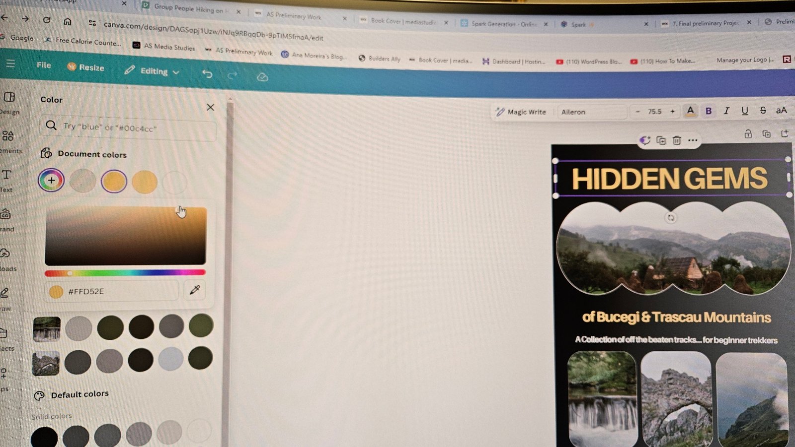
Selection of Color Pallete
I was happy to see that Canvas suggested customized color palettes to go well with the photos uploaded.
For the background I needed a dark color so that my photos would stand out. I tried different earthy colors: dark green, dark brown, black. I decided on a gradient black, to give the feeling of elegance, while the gradient style made the whole cover look more approachable by a larger target audience.
For the title I chose 2 colors:
- dark yellow/ bronze like font, which I think goes hand in hand with the elegance vibe suitable for exquisite sceneries;
- white for the subtitle, to make easier for the reader to digest the long title: first the reader would see the large yellow title to raise the curiosity, and then the explanatory subtitle would make easier the decision to take a closer look.
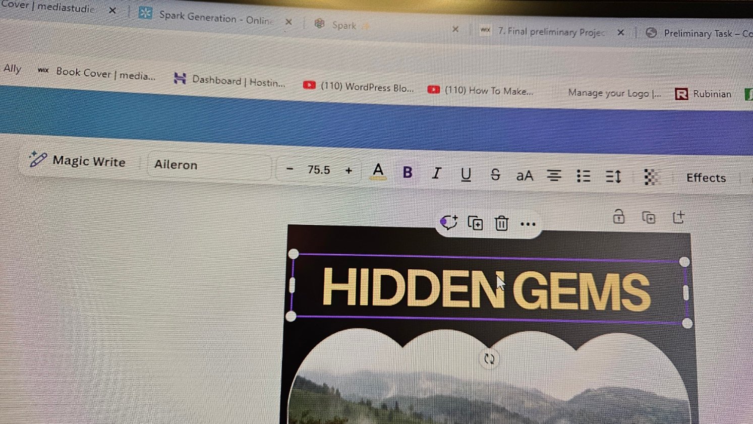
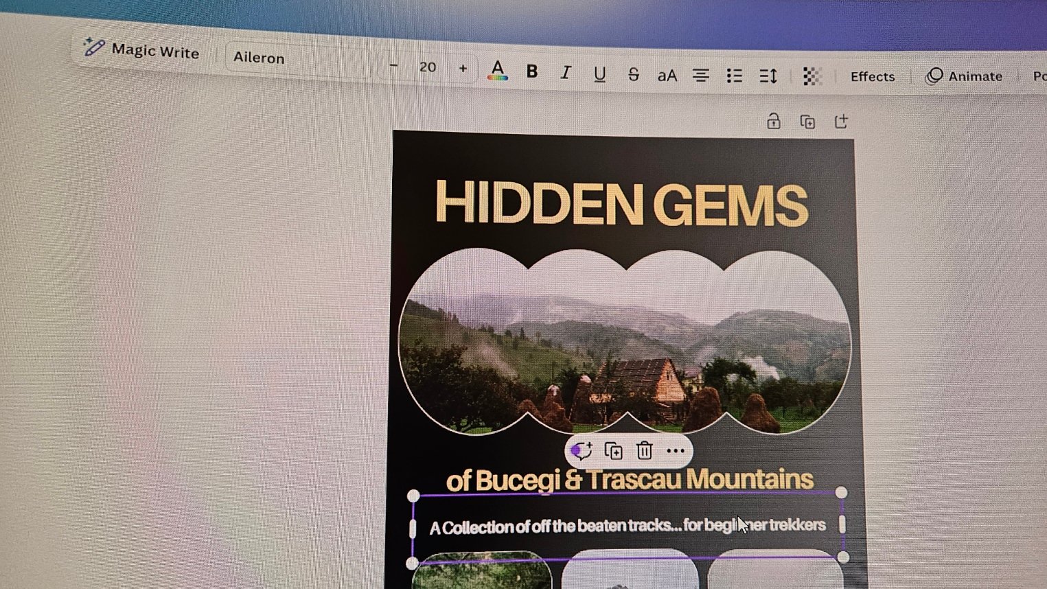
Title Placing & Fonts Used
I didn’t feel the need to change the font type of the the template, i.e. Aileron. But I needed to play a lot with the fonts size in order to incorporate such a long title while the template was prepared for one word title.
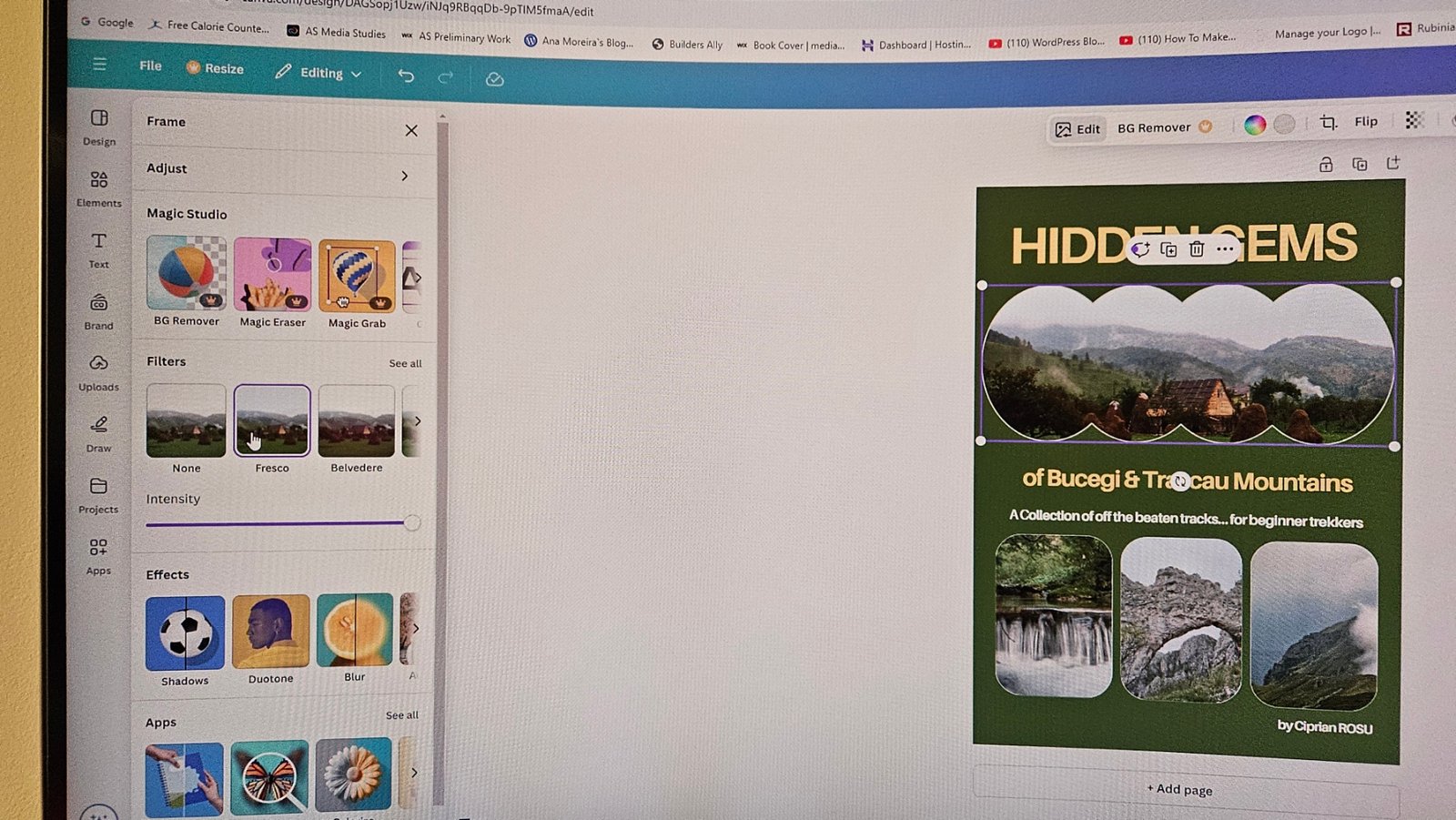
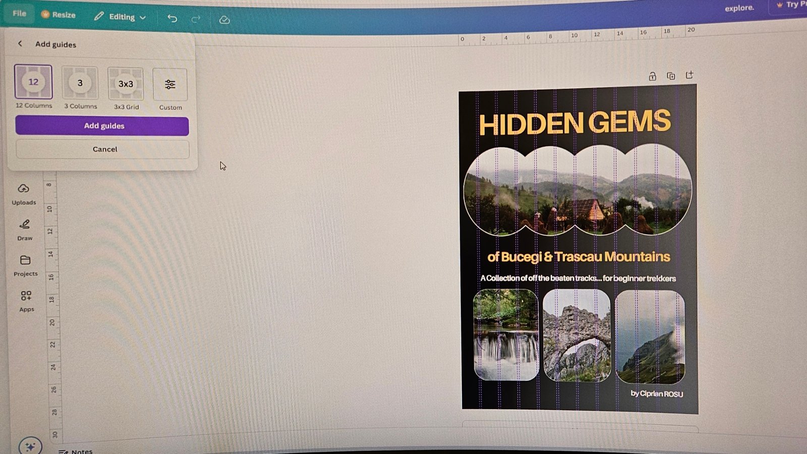
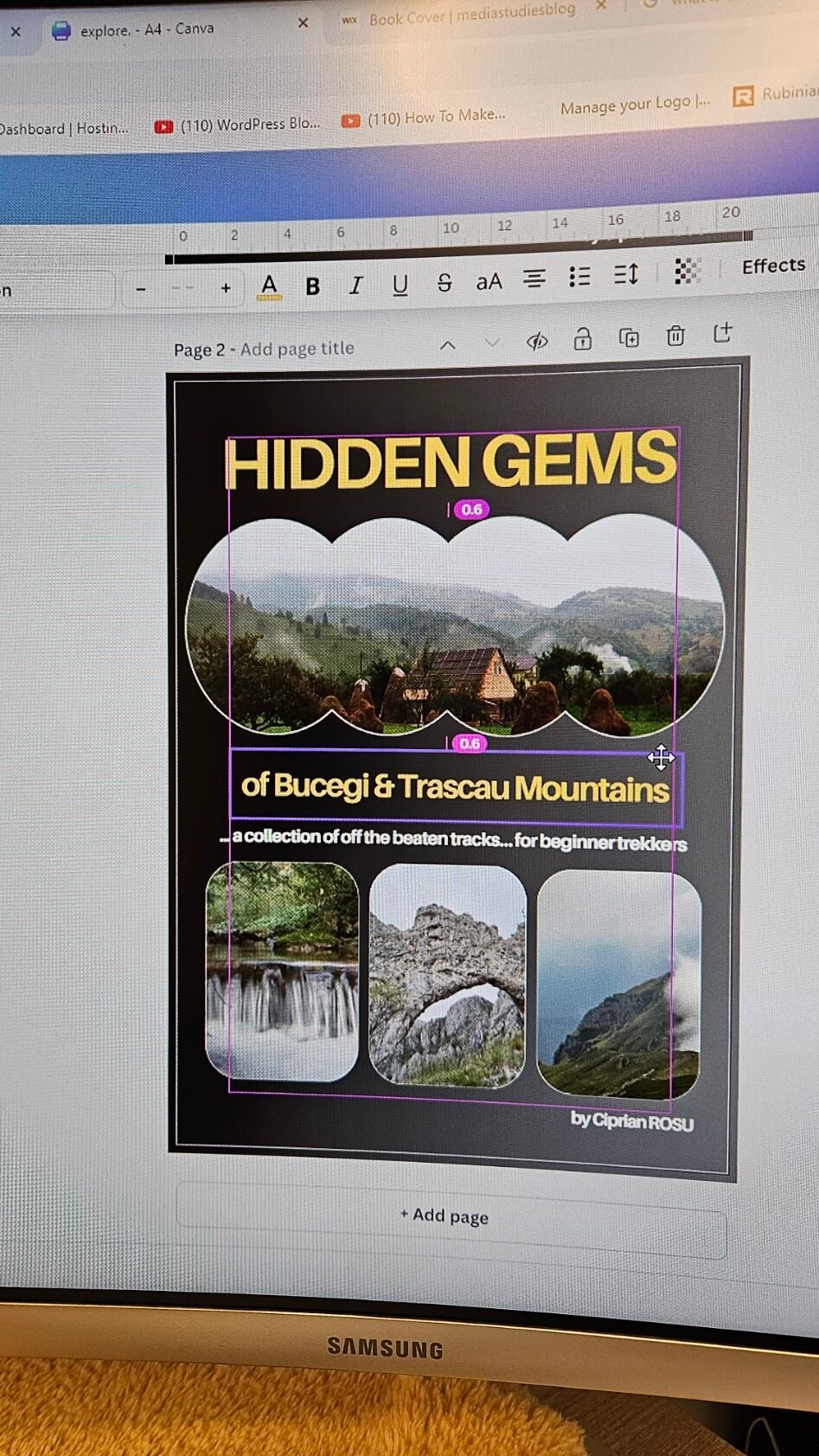
Finetuning
Finetuning took a while in terms of:
- fonts height,
- distances between title lines,
- distances between text and images;
- centered texts and images (luckily Canvas has the option to show rules and guides);
- images height;
- different color options.
Several snapshots of the work in progress can be seen below: